

網頁表格CSS設計 進階應用與物件整合
表格/
 Web Design:
Blocks - Epistemological/Digital Aesthetics
- Formation Methodology
Web Design:
Blocks - Epistemological/Digital Aesthetics
- Formation Methodology
網站/網頁設計:圖文框實作-知識美學/數位美學之建構方法
Blocks include pictures, tables and other objects such as shape and border, division, inline frames, embedded maps, photo gallery... etc.
Objects Integration 物件整合
Text-Picture Multiple-Zone Design
Wrap 盤文-文繞框設計
If you want the Wrap design, change the "wrap" from "default" to "left" (or others).
An example as the "Text Box" design lately.
 Float v.s. Align
Table wrap used to be <table align=left;> that is deprecated right now and it may cause problem.
 A very tricky Trouble of IE
Though "align" may work as "float" for <table> under some situations, it causes problems with "webbot". It is time to update the tag.
Grouping Objects with Wrap Design
For early version of xHTML, the design of 4 wrapped objects of <img> <div> <marquee> and <embed> could be sequentially coded.
However, you have to use <table> to group objects on the same side.
<img src="animation/Colorstone.gif" style="float: left;"
width="361" height="337" alt="數位內容-設計‧製作‧管理"/>
<table><tr><td>
<div style="width: 221px; height: 45px; border: 4px ridge #0000FF; padding-top:
10; padding-bottom: 1; background-color: #FFFF99">
<p style="margin-top: 12px; margin-bottom: 0; margin-left: 4px; width: 215px;">
<a target="_blank" href="../RwdTxFB/Musical_Poetry/SeanTXWu_Musical_Poetry.htm">
<marquee scrollamount="3" style="font-size: 14 pt; color: #0066FF; width: 211px;"
height="27" scrolldelay="10">你現在聆聽的是吳統雄的作品「別離」,請按這裡、或按〈人文素養〉〈詩歌曲〉欣賞他更多的創作。You
are listening 'Going Away' composed by Sean TX Wu, please click here or click
"Humanities" "Musical and Poetry" for more of his works.</marquee></a></p></div>
<p style="margin-top: 0; margin-bottom:0">
<embed src="Music/Going%20Away-Dm.mp3" height="30" align="texttop" autostart="true"
loop="true" style="width: 228px; float: text-top;" /></p>
</td></tr></table>
Asymmetrical Design 非對稱式網頁表格設計
Non-proportional Design
Table Title | |
|
Row |
|
|
Column |
1st Row |
|
2nd Row |
|
|
3rd Row |
|
Create a 3-row, 1-column table.
Right click the 1st and 2nd row, which will remain 1-column, choose "Property of Cell" and reset "colspan" as the follows.
開啟3列-1欄表。如果考慮手動 border 的 CSS 設計,可開啟1列-1欄表,加入CSS 後,再用插入方式加列。
第一、二列,設定如下。
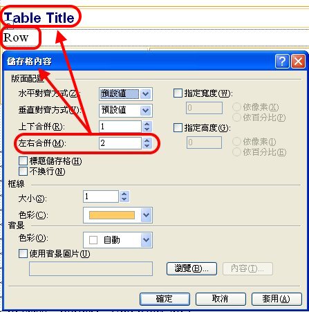
Then go to the next row, right click, and insert the "Right Cell".
Right click the left column and reset the "rowspan" to 3, then insert the 2 rows down below the right cell.
第三列,點右鍵〉插入
〉右方儲存格
第三列,左儲存格,點右鍵〉儲存格內容
〉上下合併:3
第三列,右儲存格,點右鍵〉插入
〉下方列
再插一次,合計3列。
The syntax is as the follows.
<table style="width: 100%" class="border2">
<tr>
<td colspan="2" class="border1">Table Title</td>
</tr>
<tr>
<td colspan="2" class="border1">Row</td>
</tr><tr>
<td rowspan="3" class="border1">Column</td>
<td class="border1">1st Row</td>
</tr>
<tr>
<td class="border1">2nd Row</td>
</tr>
<tr>
<td class="border1">3rd Row</td>
</tr>
</table>
The
width of cells- NBSP string 細格內寬度控制
If you put a no-break space (NBSP) string into a cell of table, it will overflow the width of your settings.
It likely happens to the URL.
If a NBSP string is too long, it will go to the next line. You need " "(space) or "-" to break it.
Creative Plane Design 創意版面設計
Chessboard Design 棋盤式設計
Right Click-Table Properties
Specify width and height in 'pixels'.
 |
 |
|
 |
||
 |
 |
Try your own imagination. 開創你自己的想像力。
雙色表格 :nth-child() 應用
nth-child() 也是一種 CSS Pseudo-classes 偽類別/特定格式標籤/副標籤。
在 .css 檔案中設定:
tr.double:nth-child(odd){
background-color:#0000FF;
}
tr.double:nth-child(even){
background-color:#FFFF00;
}
網頁程式為:
<table class="border1" style="width:100%">
<tr class="double">
<td> </td>
<td> </td>
<td> </td>
</tr>
<tr
class="double">
<td> </td>
<td> </td>
<td> </td>
</tr>
<tr class="double">
<td> </td>
<td> </td>
<td> </td>
</tr>
<tr class="double">
<td> </td>
<td> </td>
<td> </td>
</tr>
<tr class="double">
<td> </td>
<td> </td>
<td> </td>
</tr>
<tr
class="double">
<td> </td>
<td> </td>
<td> </td>
</tr>
</table>
結果如下:
Vertical Title 直題設計
Example
Questionnaires 問卷設計
Example


